Wednesday, June 3, 2020

Bayer: Forget about Monsanto

In 2012 (using the year ended 6/30/12 data), Microsoft was trading at 12.5x trailing earnings of $2.00. And this didn't account for the $7.16/share in net cash they had on the balance sheet. Net that out*, and shares were trading at 8.9x earnings.

The concern at that time had to do with the Windows segment. iPhones, Apple in general, and Androids were all chipping away at the once dominant Windows operating system. Would people even be using desktops in the future?

To account for this, I decided to net out the Windows segment from operating earnings - pretend it didn't exist. So I took full year operating income of $21.7B and subtracted off $11.9B to get $9.8B in ex-Windows income. Adjust income taxes (proportionally), and you're left with $7.9B in net income, and EPS of $0.93.

Without Windows, Microsoft was trading at 27x earnings. Adjusted for cash*, the company was trading at 19x earnings, which wasn't bad considering the growth potential of Servers / Cloud. I was very confident that Windows was worth more than $0 to the operating income line, so this analysis gave me the confidence to continue holding my MSFT shares (which I had bought in mid-2009 and was becoming disgusted with by 2012).

While this type of analysis - looking at a company's weak point and leaving it for dead - is just a form of semantics, it helps me get my hands around the fundamentals, and is also a way to make sure it really is an attractive valuation.

Today, I'm seeing a similar situation in Bayer (BAYN.DE, or the ADR in the US BAYRY). Bayer closed on the acquisition of Monsanto in the summer of 2018. Almost immediately, they walked into the glyphosate (Roundup) buzz saw when, in August 2018, a California jury awarded $289 million in a single cancer lawsuit.

To say this has weighed on Bayer's share price is an understatement. Since summer 2018, shares are down -40%. The market cap of the entire company is now 62B euros ($68B), which is roughly what they paid for Monsanto.

So here is my thesis on Bayer: remove the crop science unit (mostly Monsanto) - assume it goes to $0 EBITDA. 2019 EBITDA was 11.5B euros. Crop Science was 4.8B euros, so net (Pharma and Consumer health) EBITDA was 6.7B euros.

Enterprise value is 97.5B euros (61.6B market cap, debt of 39.1B, cash of 3.2B).

This is an EV/EBITDA (netting out the companies larges division - Crop Science) of 14.6x. Compare that to another health care company with three large divisions: Johnson & Johnson (Pharma, Consumer, Medical Devices), which is trading at an EV/EBITDA multiple of 14.0x today (Glaxosmithkline is at 11.6x, while Novartis is at 13x)

Today we can buy legacy Bayer for the same value as Johnson & Johnson, and get Monsanto for free.

While Bayer has been cheap for a while, what really got me interested was the announcement recently that they are in talks to settle 40-70% of the outstanding 125,000 glyphosate lawsuits. I think this is a major step forward for the company.

Also, anecdotally, none of the farmers I talk to are overly concerned about the cancer risk of glyphosate. Most view it as a chemical used to kill living organisms (plants), so of course you need to use precautions. But on the whole they continue to use it as a primary weed control device. Their biggest complaint isn't the cancer risk, but the fact that they've used so much glyphosate over the years that weeds have built up an immunity to it, and they're being forced to use other, more dangerous chemicals (like Paraquat).

Caveats:
  • I don't view Bayer as on par with JNJ. JNJ's Consumer division has better brands that Bayer does. It may not be the best comparable stock.
  • Bayer is a pharmaceutical stock. I've read up on their patents, pipeline, and portfolio. Most seem to think it has good potential, but let's be honest - I have no idea what I'm talking about on the pharma potential. 
  • The company will have major litigation expense going forward. Maybe Monsanto is worth less than $0? That's a risk I'm willing to take. 
Bottomline, I think Bayer is trading at too steep a discount for the quality of their underlying assets and earnings potential. Happy to hear feedback.


*I'm not a big fan of doing net of cash valuations as, in my experience, $1 cash is rarely worth $1 of share price, but I'll break my own rule in this example.


Harvest Investor © 2020. All rights reserved. The content and ideas contained in this blog represents only the opinions of the author. The content in no way constitutes investment advice, and should never be relied on in making an investment decision, ever. No content shall be construed as a recommendation to buy or sell any security or financial instrument, or to participate in any particular trading or investment strategy. The author may hold positions in the securities and companies mentioned on this site. Any position disclosed on this site may be modified or reversed without notice to you. The content herein is intended solely for the entertainment of the reader, and the author.

Thursday, June 6, 2019

Searching for Bank Acquistion Targets

I was looking at an Idaho based bank the other day, and noticed that there were only 13 FDIC insured institutions in the state.  This led to me thinking about which states have the least number of banks, which led me to thinking about which states have the most banks relative to population, which led to me wondering about banking assets per state versus population. 

All this resulted in the following table.


This table was more informational - to satisfy my own curiosity - but a couple of takeaways when thinking about bank consolidation and investing opportunities:

  1. Areas with a low assets per bank seem poised for M&A.  This is the low hanging fruit of the industry - banks looking to consolidate to remain competitive, afford new technology, and lower overall expenses.  This is the light green area of the above table.
  2. Insides of these areas, the best states would be those with a high asset to population number (these are the slightly darker shade of green).  States with above average customer deposits (assuming that higher assets to population is funded by core deposits) may present a value play for cheap bank funding.
If my logic is correct (always a questionable assumption), then the Midwest is an area to look for more bank mergers.


Harvest Investor © 2019. All rights reserved. The content and ideas contained in this blog represents only the opinions of the author. The content in no way constitutes investment advices, and should never be relied on in making an investment decision, ever. No content shall be construed as a recommendation to buy or sell any security or financial instrument, or to participate in any particular trading or investment strategy. The author may hold positions in the securities and companies mentioned on this site. Any position disclosed on this site may be modified or reversed without notice to you. The content herein is intended solely for the entertainment of the reader, and the author.

Wednesday, June 29, 2016

Growing population - Growing Farmland Productivity

The idea that world population is steadily growing is often cited as a reason to be long (bullish) agriculture technology / farmland / anything food & protein related. While I may not necessarily disagree with this logic (although, as someone who's seen a number of farm cycles up close and personal, I think some skepticism is warranted), the idea of food scarcity is often treated as self evident - excusing the need to cite hard evidence and facts. This has created a lot of distortion around the issue.

One of the biggest misnomers I see is that farmland productivity is a new issue. As I'll show below, the number of farmable acres per person has been steadily declining since at least 1960 (as far back as worldbank.org data went back). And if you want to go back further, the Reverend Malthus did his writings in 1798 (218 years ago, but who's counting?).

So, here is a quick overview of the world's food/farming situation in 5 quick graphs. All data was sourced from worldbank.org.

1. World population is growing - as it has been for centuries. As of 2015, global population had broken above 7.3 billion. Many analysts estimate there will be 9.5 billion men, women, and children on the planet by 2050, and more than 10.3 billion by 2100. That is a lot of mouths to feed. So where will all that food come from?


2. Arable acres (i.e. land suitable for agricultural production) peaked in 1992, and despite a recent uptick from 2011-2013, has held fairly steady for the past 24 years. It hasn't been more acres farmed feeding all those people . . .


3. As a result of rising population and slow (1960-1992) to flat (1992-2014) growth in worldwide farmable acreage, arable acres per person has been declining. In 1961, there were 1.2 arable acres for each person on this plant. Today, there are just 0.6 arable acres per person.


4. However, yield per acre has been steadily rising. Now this isn't a direct proxy, but looking at yield per acre for cereal grains gives us a good indication in the improvement in farmland productivity. Since 1961, yield per acre has jumped 173%. Acreage has been flat, but rising productivity per acre has kept the masses fed.


5. This all leads to looking at productivity (yield * arable acres) per person. Again, I'm using cereal grain yields as a proxy for the improvements in all of agriculture. What we see is that productivity per person has been rangebound since the early 1980s. In other words, the amount of "product" that an acre of farmland produces per global population member hasn't been declining - it has been in a fairly steady range for 36 years. Not the ominous downtrend (population outpacing productivity) that many would have you believe.


I'm not arguing that all is well in agriculture and we can just sit back and relax. Nor am I addressing some of the uses of ag commodities (i.e. ethanol) that are large beneficiaries of farmland productivity.

What I am saying is that yes, yields will need to be improved, but unless your investment time frame is 30-40 years (many will say yes, few will follow through on that commitment), be prepared for a wild ride along the way as the ag boom/bust cycle can be particularity viscous.


Harvest Investor © 2016. All rights reserved. The content and ideas contained in this blog represents only the opinions of the author. The content in no way constitutes investment advice, and should never be relied on in making an investment decision, ever. No content shall be construed as a recommendation to buy or sell any security or financial instrument, or to participate in any particular trading or investment strategy. The author may hold positions in the securities and companies mentioned on this site. Any position disclosed on this site may be modified or reversed without notice to you. The content herein is intended solely for the entertainment of the reader, and the author.

Thursday, May 19, 2016

Stocks with low earnings volatility per unit of growth

The following tweet from Eddy Elfenbein (www.crossingwallstreet.com) prompted me to run a quick analysis on all the stocks in the S&P 500:


The criteria:
  • Companies currently in the S&P 500
  • Positive earnings in every year for the past 21 years
  • Calculate (simple) average 20 year annual EPS growth rate
  • Calculate standard deviation of 20 years annual EPS growth rate
  • Coefficient of variation = Standard Deviation / Mean Return (the lower the better)

Here, ranked by coefficient of variation, are the S&P 500 stocks with the lowest risk (standard deviation) per unit of growth.  Enjoy!


Harvest Investor © 2016. All rights reserved. The content and ideas contained in this blog represents only the opinions of the author. The content in no way constitutes investment advice, and should never be relied on in making an investment decision, ever. No content shall be construed as a recommendation to buy or sell any security or financial instrument, or to participate in any particular trading or investment strategy. The author may hold positions in the securities and companies mentioned on this site. Any position disclosed on this site may be modified or reversed without notice to you. The content herein is intended solely for the entertainment of the reader, and the author.

Friday, May 13, 2016

Historic Wheat Prices: Real vs. Nominal

I was playing around with some wheat price data from the USDA NASS (found here, hat tip to Political Calculations) and wanted to share a couple of quick graphs.

First, here is a graph of wheat prices going back to 1866.  Anytime you can show 150 years of data in a chart, it's pretty cool.


However, if we put wheat prices into "real" terms, the chart changes dramatically.  Rather than a run-up in prices since ~1950, we actually see the "real" inflation adjusted value of a bushel of wheat declining from 1950 to a bottom in 2000.


I don't show this data to argue that wheat is historically cheap.  You can't make a judgement call on cheap or expensive without analyzing the numerous other factors influencing price including substitute products, production costs, or yields.  Rather, I just find it a fascinating truly long-term series of data.

A couple of quick observations:

  • The World War I price spike stands out as the pinnacle of wheat prices, peaking at over $42/bu. (in 2015 dollars) in 1917.  Interestingly, for many farmers in the northern great plains, the fallout from this (along with poor weather patterns / yields) in the 1918-1928 time frame made the "roaring 20s" a worse economic period than the Great Depression.
  • While World War II drove a second major run-up in wheat prices, it was nowhere near the levels of WWI.
  • The Great Grain Robbery of 1972 (when the USSR bought a large quantity of U.S. wheat at subsidized prices) also stands out.  This and a good overall history of the largest grain merchants is well covered and worth reading about in the book Merchants of Grain.
Where do wheat prices go from here?  I can honestly say I have no idea.  One quote, however, has always stuck with me, and that is "wheat is a weed."  Many of the old farmers say this to indicate that wheat is easily grown anywhere (prompting the joke "I can grow in on my land, so it must be a weed") and if a substitute commodity can be grown, it probably will be.


Harvest Investor © 2016. All rights reserved. The content and ideas contained in this blog represents only the opinions of the author. The content in no way constitutes investment advice, and should never be relied on in making an investment decision, ever. No content shall be construed as a recommendation to buy or sell any security or financial instrument, or to participate in any particular trading or investment strategy. The author may hold positions in the securities and companies mentioned on this site. Any position disclosed on this site may be modified or reversed without notice to you. The content herein is intended solely for the entertainment of the reader, and the author.

Friday, May 6, 2016

The Longest Dividend Streaks in the S&P 500

Out of curiosity, I recently spent 10 minutes seeing which stocks in the S&P 500 had the longest streak of consecutive dividend increases. I ran my list on the S&P 500 Dividend Aristocrats since that immediately culled my screen to those companies that have increased for at least 20 consecutive years.

I had no real reason beyond curiosity for running this analysis. Many of these companies have great “moats,” but only a handful will appeal to the “compounding aficionados” (or is it the “compounders mafia”) since the majority have limited reinvestment opportunities (hence the dividends). The opposite argument also crossed my mind - that the longer the dividend streak the greater the potential for a value-trap. You could argue it either way.

I present the following list without comment or judgement on valuation/attractiveness of any individual stock or the group as a whole. With that:


Note: All data taken from www.dividendinvestor.com and www.dividend.com. Unfortunately, even high-end data providers like Bloomberg only report individual stock data back 20 years, so, these online databases were key to compiling the data.


Harvest Investor © 2016. All rights reserved. The content and ideas contained in this blog represents only the opinions of the author. The content in no way constitutes investment advices, and should never be relied on in making an investment decision, ever. No content shall be construed as a recommendation to buy or sell any security or financial instrument, or to participate in any particular trading or investment strategy. The author may hold positions in the securities and companies mentioned on this site. Any position disclosed on this site may be modified or reversed without notice to you. The content herein is intended solely for the entertainment of the reader, and the author.

Wednesday, December 9, 2015

S&P 500 Sector Weightings: A Historical Perspective

There has been a fair amount of talk recently about Energy falling to a 6.5% weight in the S&P 500. While this is a big move from ~16% of the S&P 500 back in 2008, it is not outside of historic norms and only ~1 standard deviation from its long-term mean.

It hasn't had the attention of Energy, but Health Care earlier this year peaked at 15.5% of the S&P 500, nearly +2 standard deviations from its average. Is the recent pullback a warning of reversion to the mean for Health Care, or has the industry undergone a secular shift (aging population, longer life expediencies, Obamacare, etc.)?

Presented without further comment, here are the charts of all 10 S&P 500 sector weights vs. long-term averages and +/- standard deviation bands. Enjoy.


Harvest Investor © 2015. All rights reserved. The content and ideas contained in this blog represents only the opinions of the author. The content in no way constitutes investment advice, and should never be relied on in making an investment decision, ever. No content shall be construed as a recommendation to buy or sell any security or financial instrument, or to participate in any particular trading or investment strategy. The author may hold positions in the securities and companies mentioned on this site. Any position disclosed on this site may be modified or reversed without notice to you. The content herein is intended solely for the entertainment of the reader, and the author.

Thursday, October 8, 2015

Vehicle Loans, American Workers, and Car Prices


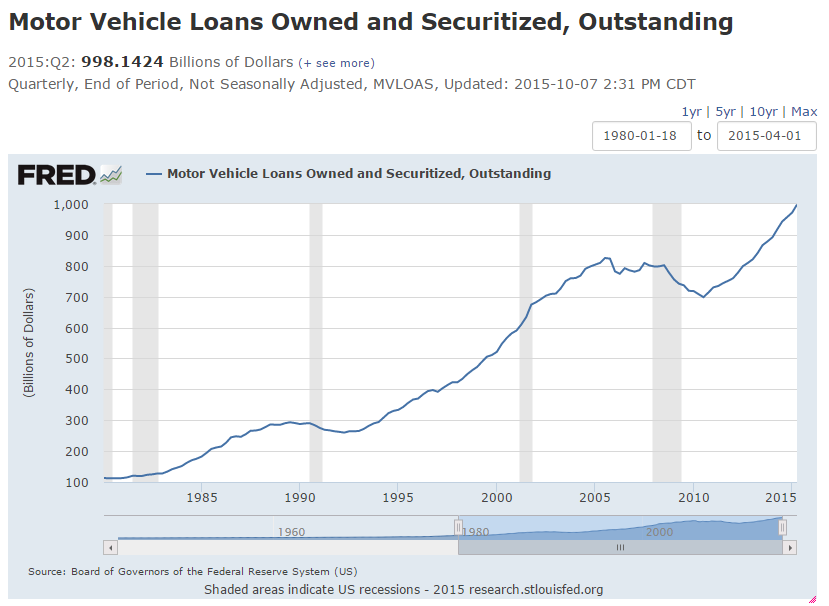
I’ve seen some recent reports on the record amount of auto debt in the U.S. financial system floating around the web. Most of the reports reference, in one form or another, the following chart showing motor Vehicle Loans held by U.S. financial institutions.


While this measure arguably misses some of the vehicle loans in the “non-traditional” lending channel (shadow banking anyone?), it’s still a good representation of the growth in auto debt in recent years. Since the last peak (which was 12/31/05), auto loans have grown just over 21%.

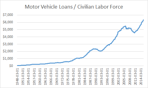
However, what we also need to mention is that population has grown as well. Below I show the amount of motor vehicle loans divided by the civilian labor force. I used labor force under the assumption that only people with a job can qualify for a car loan (a dubious assumption I know, but just go with me here).


What this chart tells me is that the average working person in America has $6,356 worth of auto debt. This compares to about $100 of auto debt per American worker back in 1950.

Since the last peak (12/31/05), auto debt per worker is up just shy of 16%. While still a sizeable jump, it's better than the 21% headline growth since 2005.

Of course, thinking about the growth in debt per American worker since 1950 got me to thinking about how much a car cost in 1950. The internet (they have that on computers now) tells me that a new car cost $1,510 in 1950. Today, the average new car costs $33,560. A 22 fold increase in car prices has been met with a 64 fold increase in vehicle debt per worker.

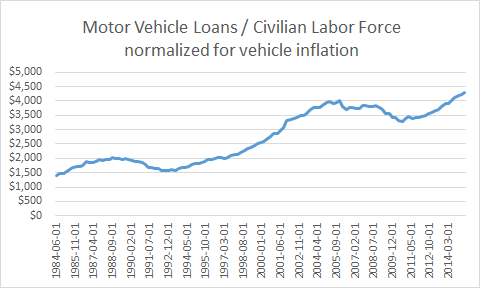
So I downloaded consumer price index (CPI) data on new vehicles. Unfortunately, the data only goes back to 1984. Nonetheless, if we normalize the auto debt per worker for the CPI on New Vehicles (debt/workers/(Auto CPI - 100)) we get the following chart:


Normalized for inflation, the average U.S. employee had $4,010 of auto debt in December 2005 (previous peak) vs. $4,309 today, for an increase of 7.4%. While still growth, a 7% increase in the last decade is a far cry from the 21% growth in the headline number above.

I’m not sure what the takeaway is here - I need to think more about these numbers and what they actually mean. Probably the best takeaway, as usual, is that this business of investing is simple, but not easy.

Please feel free to respond and/or correct any gaps in my thinking.


Harvest Investor © 2015. All rights reserved. The content and ideas contained in this blog represents only the opinions of the author. The content in no way constitutes investment advice, and should never be relied on in making an investment decision, ever. No content shall be construed as a recommendation to buy or sell any security or financial instrument, or to participate in any particular trading or investment strategy. The author may hold positions in the securities and companies mentioned on this site. Any position disclosed on this site may be modified or reversed without notice to you. The content herein is intended solely for the entertainment of the reader, and the author.

Thursday, April 16, 2015

Buhler Industries (TSE:BUI): Inventorying this Net-Net

I have to admit, Buhler Industries (TSE:BUI) calls to me like a siren’s song.  What can I say, I have a weakness for net-net stocks.  And in many ways, BUI is my ideal net-net:
  • It’s in an industry I (sort of) understand: Farm Equipment Manufacturing.
  • It has a long history of profitability: EPS have been positive in every single fiscal year going back to at least 1993.
  • Its foray into 4WD tractors has been initially successful based on reviews of its Versatile DeltaTrack models.
  • Best of all, it trades at a discount to net current asset value (NCAV). As of December 31, 2014, NCAV was $5.56 per share, compared to the current quote of $5.20.
A historically profitable company trading at a discount to liquidation value - a rare find in this market.

Now, admittedly, there are issues surrounding BUI that give one pause, not the least of which is the ownership structure:
  • Despite having a market cap of C$130,000,000, BUI has a very low float.
    • In 2007, Combine Factory Rostselmash Ltd, a Russian manufacturer of combines, bought 80% of Buhler. The company remains headquartered and operated in Canada (with some U.S. manufacturing facilities), but the new owners have provided a potential growth avenue into Russia and Eastern Europe through co-marketing with Rostselmash.
  • John Buhler (the retired CEO, current Board member and namesake of the company) still owns 14.5% of outstanding shares as of the most recent proxy. 
  • The company’s deferred profit sharing plan owns another ~1%.
All told, BUI has a float of only ~4.5% of shares outstanding. This is 1,125,000 shares, or less than C$6 million at current prices. To say we would be minority shareholders in this stock seems like an understatement. 

While these issues certainly play into any purchase analysis, more concerning to me is the growing imbalance between revenues and inventories. In fact, many short sellers will use slowing sales and continued additions to inventory as a textbook screen for short ideas.


Now, arguably, some of this growing disparity is likely priced into shares considering they are trading for slightly less than NCAV. Yet, when we compare BUI’s numbers to peers, it is staggering how large its stockpiles of inventory and accounts receivable have become:


Among peers it has (usually by a wide margin):
  • The longest receivables collection period
  • The most days inventory on hand
  • The highest inventory per employee
  • And, despite a slowing ag economy, saw both its accounts receivables and inventory grow over the past twelve months.
In other words, I have some doubt that BUI could liquidate itself for NCAV. Additionally, BUI is having trouble converting working capital assets into cash (it has virtually no cash on hand), as evidenced by the receivables aging trends shown below:


As the above table from the 2014 annual report (year ended 9/30/14) shows, there has been a dramatic spike not just in accounts receivable, but particularly in the accounts receivable delinquent. In total, 17.2% of receivables are past due, with 10.1% of the total over 30 days delinquent. Comparatively, 6.4% of receivables were past due at the end of fiscal 2013, and a more manageable 3.5% were over 30 days delinquent.

Finally, due to balance sheet leverage, the margin of safety associated with this net-net could quickly disappear. Current Assets / Total Liabilities come to only 1.89 as of Dec. 31, 2014.  Although not a hard and fast rule, I use the rule of thumb that a net-net should have CA/TL of  at least 2.0 to lessen the impact of financial leverage on my margin of safety.  At a reading of 1.89, even a small receivables write-off and/or inventory discount could significantly impact Buhler's book value and NCAV:


So all this leads me to the question: what is Buhler Industries worth?

Over the past 10 years, BUI has averaged annual EPS of $0.43. Assign a 13x multiple to this (not sure why I chose 13, but it seems right given minority shareholder status) and we get an intrinsic value of $5.59.

Backing into valuation a slightly different way, over the last decade ROE has averaged 9.0%. To get a 10% annual return on a 9.0% ROE stock we should pay 0.9x book value.  Again, assume we take a discount for minority status, and we could in theory pay 0.8x book value for shares. At a recent book value of $7.79, this comes to $6.23 (and assumes there will be NO write-downs in accounts receivable or inventory, which I’d be surprised to see happen).

If we feel intrinsic value is somewhere between $5.50 and $6.00 per share, and since I like to buy at a discount, I’m not going to get too interested in Buhler until I see a price in the low $4 range (and even then, I’ll still need to get comfortable with my standing as a minority shareholder and who is the marginal buyer of BUI).

Ironically, a price in the low $4's would be pretty close to the old Benjamin Graham rule of buying a net-net at 2/3rds of NCAV.  So all that work I just did in the preceding paragraphs could be summed up by a very simple quantitative rule developed over 80 years ago.  Maybe there's a lesson for me there?

Full Disclosure: I own a handful of BUI shares (mainly for tracking purposes). I do not consider BUI a position in my portfolio.

Harvest Investor © 2015. All rights reserved. The content and ideas contained in this blog represents only the opinions of the author. The content in no way constitutes investment advice, and should never be relied on in making an investment decision, ever. No content shall be construed as a recommendation to buy or sell any security or financial instrument, or to participate in any particular trading or investment strategy. The author may hold positions in the securities and companies mentioned on this site. Any position disclosed on this site may be modified or reversed without notice to you. The content herein is intended solely for the entertainment of the reader, and the author.

Friday, April 3, 2015

P&C Insurers and Net Investment Per Share: The 1 Column Approach to Valuation

A recent post by The Brooklyn Investor on Markel (MKL) got me thinking about the two column approach to valuing hybrid insurance / capital allocation companies like Berkshire Hathaway or Markel.

The two column approach says that an insurance company with a history of profitable underwriting (i.e. a combined ratio consistently below 100%) has two sources of valuation (actually three, but the third is an intangible aspect difficult to estimate):
  • The value of net investments per share (since investments are funded with “float,” which at a well underwrote insurer is a perpetual negative cost source of funding and therefore not a true liability).
  • Earnings (at an appropriate multiple) from non-insurance operations.
As you would expect, Warren Buffett does an immensely better job of explaining this valuation method. See the 2010 Berkshire Annual Report, page 6.

For almost all insurers, #2 above can be ignored since very few have non-insurance operations. Even Markel, which is considered a “mini-Berkshire” by many investors, earns such a small amount (at least currently) from its “Markel Ventures” subsidiary that non-insurance operations can be thought of as a rounding error (The Brooklyn Investor addressed this in a subsequent post).

So, for most insurers out there, this leaves us with 1 column: net investment per share. Many analysts feel comfortable using this metric for Markel, but it is hardly ever used when looking at the run of the mill P&C insurer. I've often wondered why that is, so I decided to run the “1 column” valuation for a group of large P&C insurers.  Net investments per share = ((cash + total investments - short-term debt - long-term debt) / shares outstanding). (Please Note: Net Investments in the table below do not adjust for deferred acquisition charges, reinsurance agreements, and other line items that may distort comparisons among companies).


The results show that Markel is not cheaper than peer P&C companies. In fact, it is above average (higher priced) when we look at the price/investments column (i.e. you’re paying $0.68 for every dollar of net investments at MKL, and only $0.575 at the average peer).

Is it justified to pay more for MKL? Many would argue yes. It has a history of solid investment portfolio performance, book value growth, and underwriting. Yet, at least over the past decade, its peers also have a history of solid underwriting (average combined ratio of 92.1% although, admittedly, many insurers have higher volatility in their combined ratio than MKL and the last decade has been somewhat benign in terms of catastrophic losses).

Will Markel's management be able to continue growing book value at double digit rates and finding attractive investment opportunities? That is the $64,000 question isn't it? While valuation relative to net investments per share can give us a feel for how richly priced shares are, like almost all Financial companies with no competitive advantage outside of people/culture, it all comes down to our faith in management.

And that brings me to the main point of thinking about this. Why don’t more large P&C insurers follow the hybrid / capital allocation model? The benefits of negative cost “float,” the inherent leverage in using unearned insurance premiums, and the virtuous cycle of reinvesting cash flows from high quality investments are all well documented. Wouldn't the entire insurance industry benefit from skewing in this direction?

Of course, this is a little bit like asking why don’t more people buy stocks when they’re cheap (or as Will Rogers once wrote: “Buy stocks that go up; if they don’t go up, don’t buy them”). Finding a really good capital allocator (like Warren Buffett or Tom Gaynor) is beyond needle in a haystack difficult. On top of this, finding an insurance organization with the discipline to consistently underwrite profitable policies (and more importantly walk away from unprofitable policies) is just as difficult.

But still, there is room for improvement. Couldn't an activists target Allstate to capture some of the value of its investment portfolio? I see hedge funds going to the trouble of starting their own reinsurance companies to get “permanent funding” . . . isn't W.R. Berkley a ready made target for permanent capital (I do realize there would be plenty of conflicts of interest in being an activist in a P&C insurer and then inserting yourself into the management of said insurers investment portfolio). Conversely, why hasn't a large insurer scooped up MKL in an effort to capture its hybrid business model on a larger asset base? (obvious answer: why would you buy a smaller company just to replace yourself and your entire executive team?).

Maybe I’m just way off base and don’t understand insurance accounting well enough. Maybe the hybrid model only works when its built from the ground up (Warren Buffett does spend a lot of time discussing culture and partnership in his writings). Or, Maybe I've been brainwashed by the value investing communities infatuation with all things Buffett. 

Whatever the answer, the “1 column” valuation approach seems to show that MKL already has some premium built in (compared to peers) for its capital allocation and underwriting skills. Is the premium high or low? Time will tell.


Disclosure: Long MKL


Harvest Investor © 2015. All rights reserved. The content and ideas contained in this blog represents only the opinions of the author. The content in no way constitutes investment advice, and should never be relied on in making an investment decision, ever. No content shall be construed as a recommendation to buy or sell any security or financial instrument, or to participate in any particular trading or investment strategy. The author may hold positions in the securities and companies mentioned on this site. Any position disclosed on this site may be modified or reversed without notice to you. The content herein is intended solely for the entertainment of the reader, and the author.